-

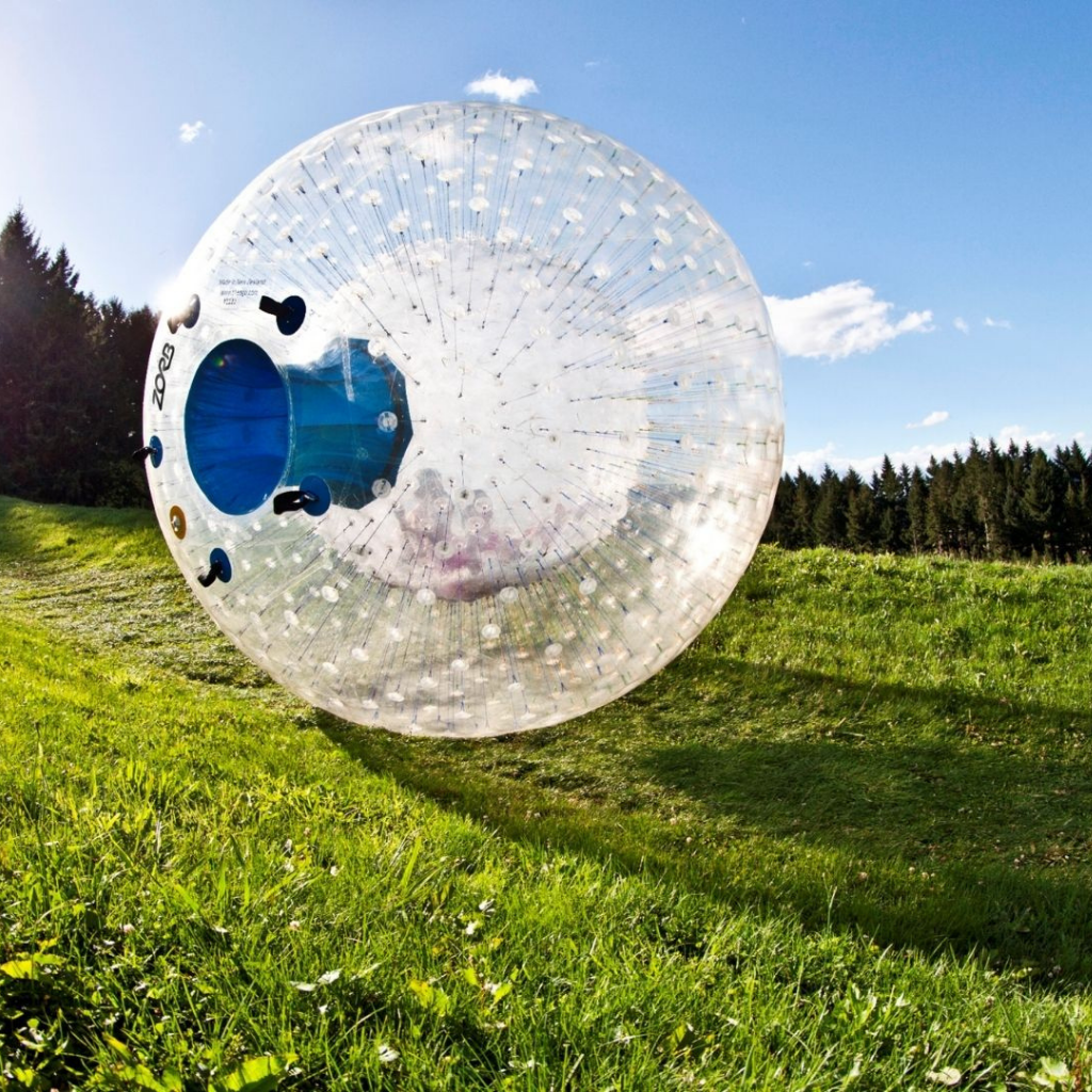
Zorb
What to do when things are going downhill
Throwback to 2021 – and an outdated website that didn’t celebrate what Zorb truly is today. It was difficult for users to easily browse and compare different rides, and it was overly-targeted towards backpackers and yo-pro’s, alienating plenty of other potential Zorbers. After all, the oldest participant is 85-years-old!
Now, as Zorb has evolved, so too has the website, with a clear focus on showcasing the exhilarating bucket-list experience, as well as highlighting the wider Zorb New Zealand corporate offering.
Out with the old, in with the new
So with this in mind, Zorb and Maverick Digital teamed up to create an all-new digital footprint for the legendary brand. Following their brand guidelines, the new site is a playful and vibrant reflection of their values – making connections, having a great time, and not taking yourself too seriously.
From the moment you enter the site, you’ll have a smile on your dial. An attention-grabbing header video is a laughter-inducing teaser of the entire experience, filled with clips of their target audiences in action – young professionals, families and silver surfers all having the ride of a lifetime.
From here, the homepage allows you to scroll and discover the different wild rides on offer – whilst of course, keeping plenty of surprises for the big day itself.
The path-to-purchase is clear and simple, with CTA buttons embedded throughout the product descriptions. The UX neatly flows through into an invitation to purchase a package and experience multiple rides – because we all know once is never enough!
To round out the experience – and for those who need just a bit more convincing – TripAdvisor review snippets and a scrapbook-style Instagram feed are seamlessly integrated above the footer.
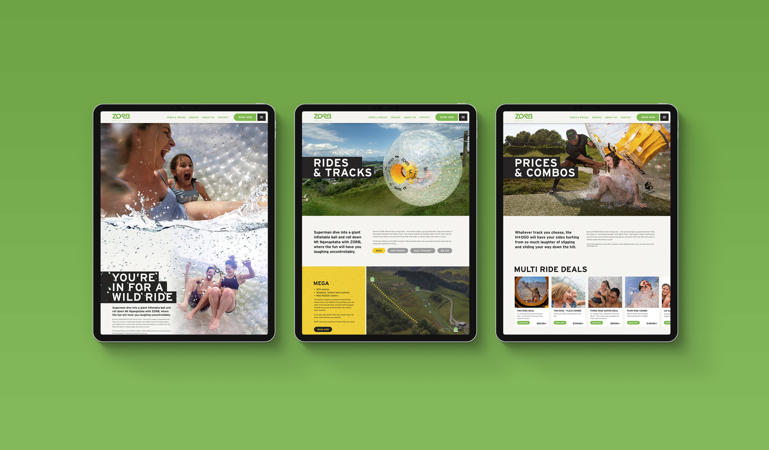
Four tracks, one hill
A visual-led design was a core component of the website refresh, with a crisp and clean layout that features bold typography and bright colours.
To distinguish between the four unique tracks, we allocated each one a distinctive colour palette – which is consistent across the entire site.
Large colour blocks on the homepage neatly display the key differences between each ride, and a carousel allows the user to flick between tracks to choose the adventure that suits them best. This vibrant colour scheme is also echoed on a high-resolution map that showcases each track’s location on the hill.
A clear and concise sitemap
As the saying goes, less is more, and a good spruce-up behind-the-scenes resulted in a simplified website structure. A tidy sidebar navigation allows users with specific needs or queries to find the information they require, whilst the homepage still serves as an all-in-one journey to peruse and purchase.
Commonly asked questions about the experience are subtly answered across the site, and reinforce the key USP’s of Zorb being an all-weather, all-year-round activity.
Already, web traffic results are off to a flying start. In the first two months following the new site going live, bounce rate has fallen by 20%, page views per session are up by 22% and time on site is up 27%, proving that the users are really engaging with the fresh layout and awesome content.
We’re excited to continue seeing these results soar, as international borders re-open and the good times keep on rolling!
Related Work
Lets Talk
Ready to connect?
We're a team of tourism and digital experts who hang our hats on doing high impact work that affects your bottom line.